PORTFOLIO
CHRISTY ANNA PHOTOGRAPHY
BRAND IDENTITY & STYLE GUIDE, WEB DESIGN & DEVELOPMENT
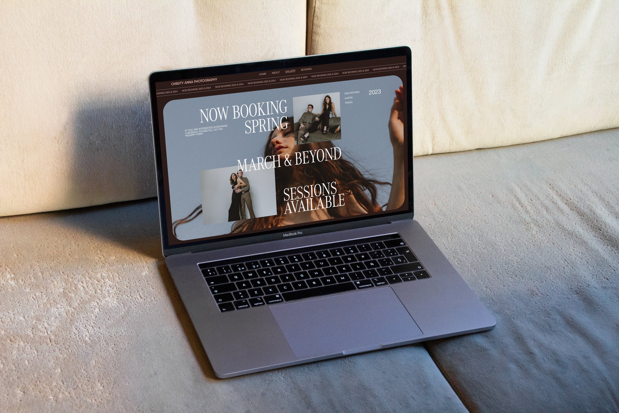
2021 & 2023
SAN ANTONIO, TX
Christy Anna Photography exists to create art and experiences that embody and perpetuate the belief that our differences are what make us beautiful. In a world where photographers are easy to find, Christy Anna Photography has continued to shine in this space by pushing the boundaries, inducing emotion and provoking thought in every frame. With instinctual artistic vision, education and a heart of gold, Christy will capture any occasion beautifully, and leave each client feeling better than before.
We have been honored to work with Christy on more than one occasion. In 2021 we created her Brand Identity & Style Guide, with additional designed assets. Two years later, we used this branding as the foundation to design and develop a new completely custom website.
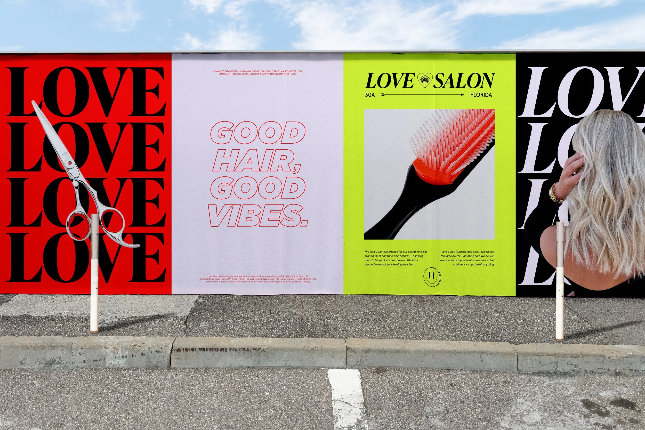
LOVE SALON
BRAND IDENTITY & STYLE GUIDE, BRANDED ASSETS, APPAREL
SUMMER 2022
30A, FL
If Love Salon were an actual person, she would be that girl who always catches your attention. She’s fun-loving, kind, vibrant, trend-setting and makes you feel your best — she’s the babe everyone wants to be, and be around.
The identity direction titled “Playful & Posh” is clean, edgy and packs a (playful) punch — unapologetically. With the juxtaposition of retro and modern typefaces, and elements that are inspired by classic symbols and objects — like a smiley face or a playing card — this identity feels familiar, yet fresh and easy to love.
Bold pops of personality and luxury have been infused into every detail of this identity. We wanted Love Salon to stand apart from others in this highly competitive industry, with this unexpected brand ID and apparel collection that serves fun and fresh vibes on a posh platter.
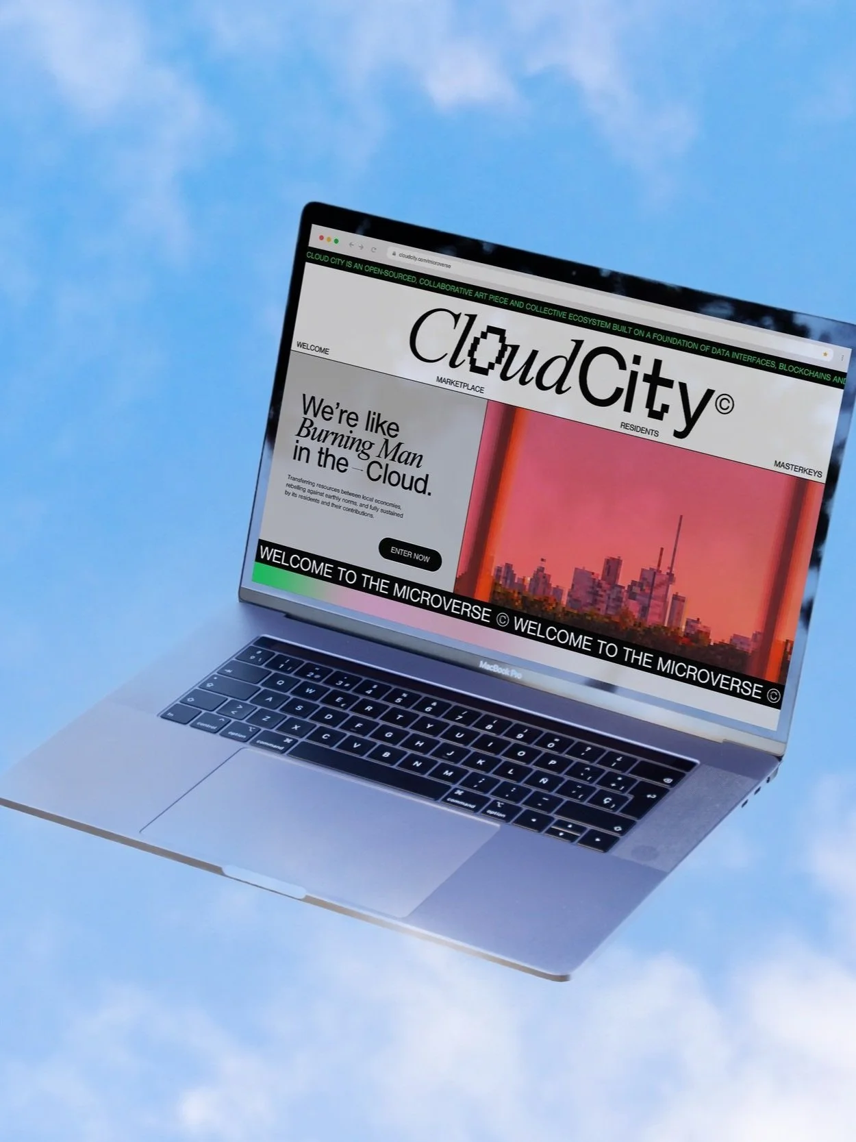
CLOUD CITY©
BRAND IDENTITY & STYLE GUIDE, ASSETS, CONTENT CREATION
SPRING 2022
SEATTLE, WA
Cloud City is an open-sourced, collaborative art piece and collective ecosystem built on a foundation of data interfaces, blockchains and silicone circuit, spanning multiple platforms, and existing as a port in the sky — transferring resources between local economies, rebelling against earthly norms, and fully sustained by its residents and their contributions.
The brand identity direction we took, titled “Neoclassical” is elegantly simple — yet complex in its polarity — where Masculine meets Feminine, Mechanical meets Human, Classical meets Modern, Hard meets Soft, and Past meets Future. It pulls aesthetically from the dawning days of internet culture yet carries itself in a futuristic way with modernized design elements and principles interwoven. The intention was to create familiarity for what has been in an effort to bring comfort and hope to what will be.

ONETACO.
SOCIAL MEDIA MANAGEMENT, BRANDED ASSETS, CONTENT CREATION
AUSTIN, TX
2021 - 2022
As taco experts, ONETACO. says that the best version of a taco is an Authentic Mexican Taco, and are committed to making authentic better. With a purpose to share their food, culture, knowledge and hearts with communities across the United States, ONETACO partnered with us to help them craft and tell their beautiful story both visually and through new brand messaging.
We Can Brand provided creative direction and designed updated assets, graphics for digital and print, and an updated Brand and Style Guide for ONETACO. We implemented a fresh organic social media strategy featuring saucy design and short-form video content to serve as the foundation for building a loyal (and hungry) following — and provide direction for content creation, social, sponsorship, and influencer management.
BIOTECH X-RAY INC.
BRAND IDENTITY & STYLE GUIDE, BRANDED ASSETS
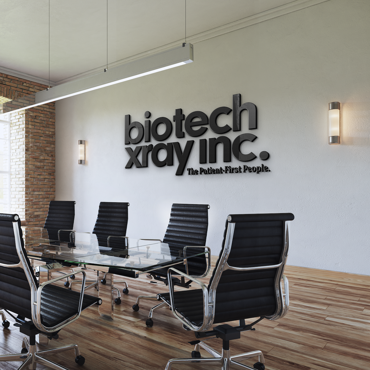
SUMMER 2021
ST. LOUIS, MO
BioTech X-ray Inc. has been serving in the Mobile Diagnostic Imaging industry for over 25 years. Classic, clean and approachable — this brand identity, named “Diagnostics to your Door,” highlights the warm humanity and patient-centered care being provided.
An arrow tucked within a bold, professional sans serif typeface is representative of their on-the-go business model (traveling directly to their patients’ bedsides), while also serving as a nod to their longstanding reputation as a forward-thinking company. Their new brand identity — including a minimal wordmark paired with fresh colors and friendly approachable typefaces, conveys the core essence of BTX: The Patient-First People.
MODERN MOVE
BRAND IDENTITY & STYLE GUIDE, BRANDED TEMPLATES & ASSETS
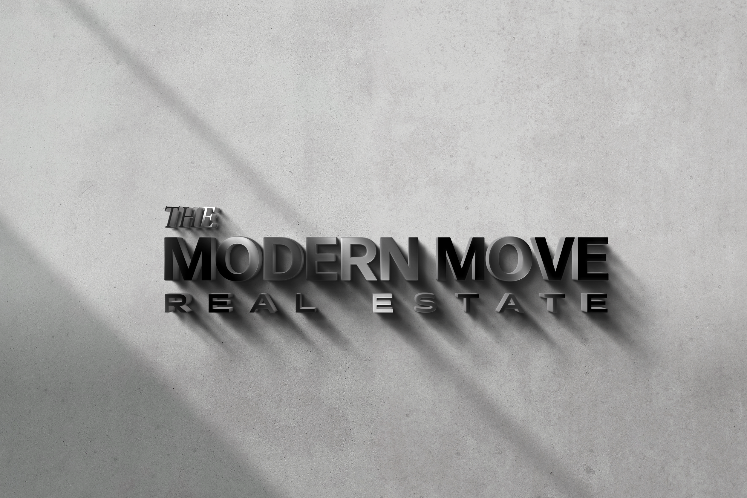
SPRING 2021
HOUSTON, TX
The Modern Move is a young, fresh company making waves in Houston, by offering their expertise on the local apartment and rental market. They reached out to us wanting to elevate their brand’s visual identity and social strategy in order to reach their intended target audience and stand apart from their competition in this industry.
We titled this direction “Fresh Foundation” and centered it around simplicity at its finest. With crisp, thin lines, paired with simple forms and shapes, Fresh Foundation feels clean and refined — without ever sinking into the “boring” or “basic” categories.
It makes a clean and straightforward introduction to Modern Move without any additional fluff or distraction. The space allows for freedom, and for the core messaging, content and copy to shine through as the real hero — standing firmly on its foundation through shifting trends.
YELLOW MONDAY
BRAND IDENTITY & STYLE GUIDE, BRANDED ASSETS
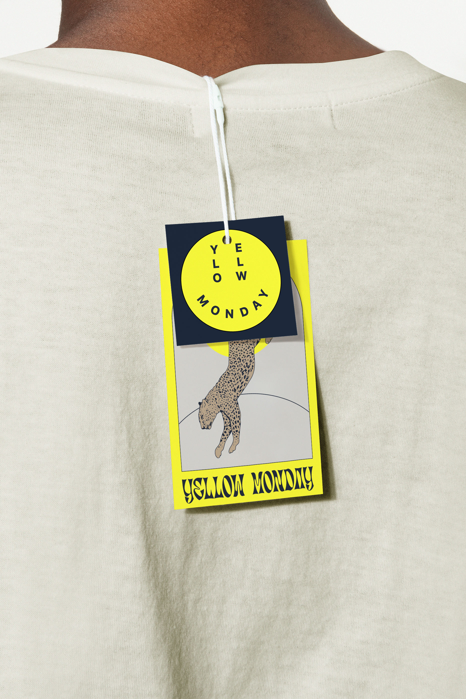
SPRING 2021
SAN ANTONIO, TX
This brand ID created for Latina-owned Yellow Monday Boutique, was inspired by the mid-century motels of yesteryear. The custom illustrated cheetah and cheeky cacti-turned-logo, speaks to the wild nature of the Yellow Monday brand. The cheetah takes direction from no-one, like the customers of Yellow Monday Boutique — where rules are meant to be broken.
Through the combination of retro and modern typefaces, it gives off a vibe that instantly feels classic, but fresh and easy to love. The elements nod to symbols and objects that are fun and familiar — without sacrificing vibrant individuality.
This fun, edgy, and free-spirited identity is unexpected for a boutique, and created to stand apart from others in this space with its contradiction of sophistication steeped in wild rebellion. Her tagline “Feel Good Look Good” flips the age-old cliché on its head, prioritizing confidence and joy over superficiality — just like her new brand identity!
CHI EPSILON SIGMA
BRAND IDENTITY & STYLE GUIDE, BRANDED ASSETS, MERCH

SPRING 2021
DALLAS, TX
Chi Epsilon Sigma is an official constituent of the largest student nursing organization in the United States — National Student Nurses’ Association, Inc. They wanted to be more than just another nursing organization — by creating a strong community in the DFW areas for nursing students and faculty to thrive inside and out of their professions.
They hired us to deliver a new brand ID, which was eventually titled “High Fashion Meets Modern Medicine.” The new CES brand leans slightly more crisp and edgy to appeal to students and emerging nurses, by meshing traditional medical symbolism with geometric simplicity.
The merging of a bold extended typeface with Apple’s original Garamond type provides a duality of classic meeting cutting-edge — alluding to the timeless necessity of this persistently evolving career path.
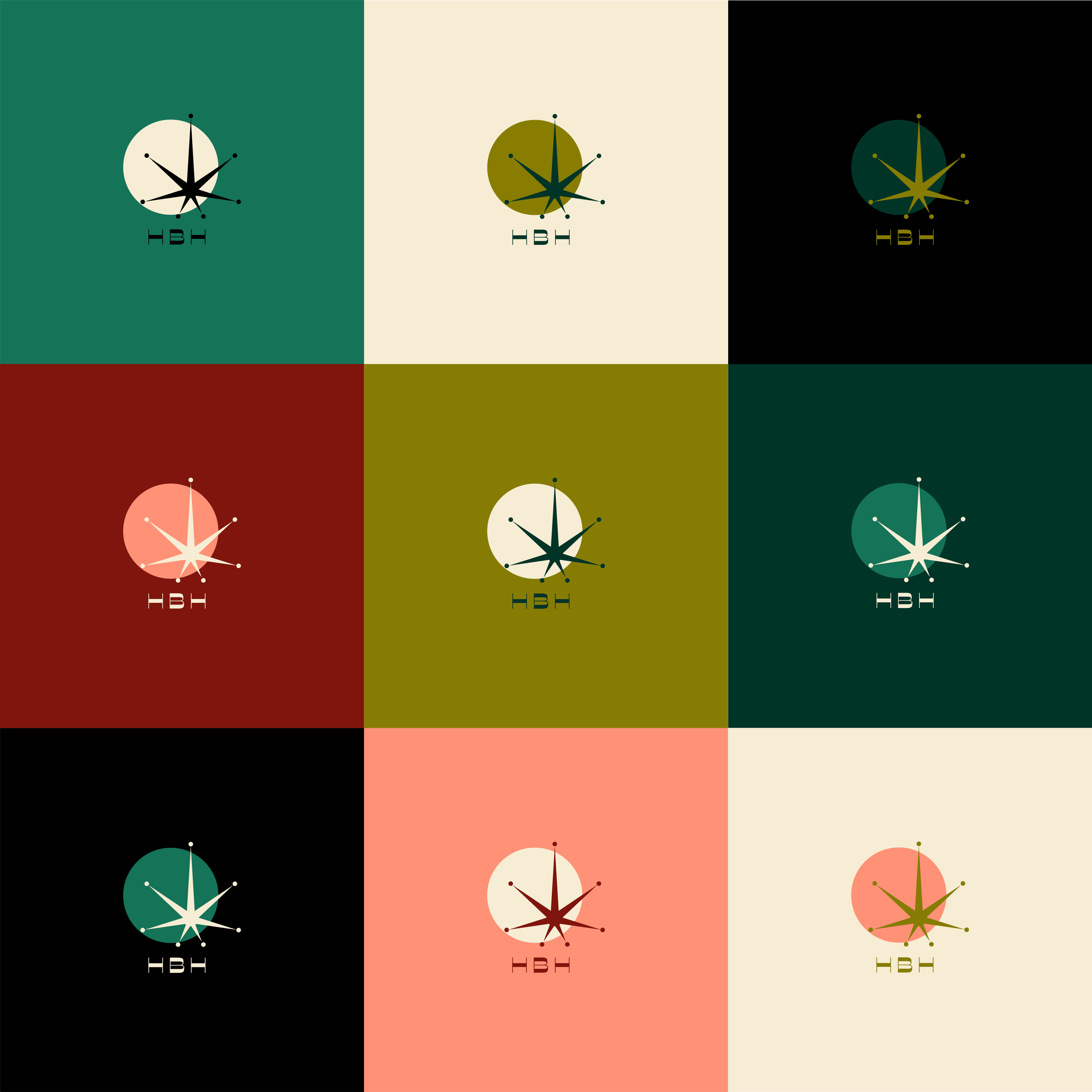
HALF BAKED HOUSEWIVES
BRAND IDENTITY, SOCIAL MEDIA, CONTENT CREATION, MERCH, +